After hitting some delays with volunteer voice actors, I decided to have a go at turning my animation into a comic. No voice actors required! I still want to finish the videos, but this blog is capturing some of my discoveries, as a newbie to comic artwork.
First, there are numerous articles around on all sorts of topics with artwork. How to lay out pages, how to draw and position speech bubbles, and so on. A few web searches brought up lots of good advice. I am not going to cover it all here, just what I found most useful.
Adobe Indesign
I have the Adobe Creative suite. I use Adobe Draw on my iPad for drawing artwork, Adobe Illustrator for computer based editing and drawing (and assembling it into better structured layers), Adobe Character Animator to animate the characters, and so forth. So to be consistent, I went with Adobe Indesign to lay out my pages.
In particular, I export PNG files from Character Animator using “Export Frame” from the menus. (Sometimes I render out a video, then use Premier Pro to extract a frame instead – it works better with walk behaviors and physics behaviors.)
I use Character Animator to position the arms, legs, mouth positions, etc, then capture a single frame. For me I use the same project as the actual videos I am also creating, so its frequently just a matter of going through the scenes and saving a series of screen shots. My video is 1080p (1920×1080 pixels), which turned out to work well for comics as well.
DPI and Resolution
So what DPI (dots per inch) and resolution (pixel dimensions) are best for a comic? I thought I might try print it one day, so I targeted 300dpi (the limit of what most home printers can handle). For paper size, I found there are a few standards. Since my artwork is Anime inspired, I went with the Japanese Manga book size of 6.625 x 10.25 inches (although I don’t know where I got this from now!) Definitely think about this before you start – its hard to change later! For example, do you want to print a comic? Check standard sizes for printing (custom sizes can cost more). Do you want to display online? You might want to think about common table aspect ratios.
Taking those dimensions, it means a full screen image is 1987 x 3075 pixels. For my front page, I created a special scene in Character Animator with those dimensions so I could get full sized characters on the front page at good resolution. As my artwork is in Illustrator (not Photoshop where you have to watch for pixilation), it scaled up pretty well.
You might think 300dpi is pretty high for comics. Personally I am a bit worried it might not be high enough. It has worked fine so far, but you have to remember if someone is viewing on a tablet, they have very high resolution screens these days, and the user may zoom in on the image. So you want enough resolution for it still to look good zoomed in on a high resolution display. Also 200dpi I know looks pretty grainy from scanners, so to me 300dpi is on the edge of acceptability. I don’t want to go too high in resolution however as it increases the file sizes.
Images
With 300dpi and a page being around 3075 pixels high, as I plan to put multiple frames down a page, 1080p images (1920×1080) came out just right. This made my life easier as well – I can share the same scenes and resolution for my cartoon videos as my comics. So nice bonus. I do create the occasional scene in Character Animator for higher resolution images (like the front cover with full height characters), but most of the time I just use my video projects as is.
The front page I found doing things like subtle drop shadows on the title text helps. I also found a font I liked, but it was a bit light. So I picked “Type” / “Create Outlines” which turns the highlited text into paths, I set “Stroke Width” to around 3pt, set the color, change the Object effects to include drop shadow (distance = 0). My covers are not attractive, but they do the purpose while I am learning the ropes.
Frames
So how to lay out a page? Again, there are lots of guides on the web, and a lot of creativity can go into this stage. I normally go with rectangles because its easier, with the occasional exception to spice things up where I want to draw special attention.


Even with rectangles, changing the size and positioning makes a page more interesting. The most important tip I picked up was to make sure it is clear how an eye should flow down a page. Horizontally aligned frames encourage sideways reading.
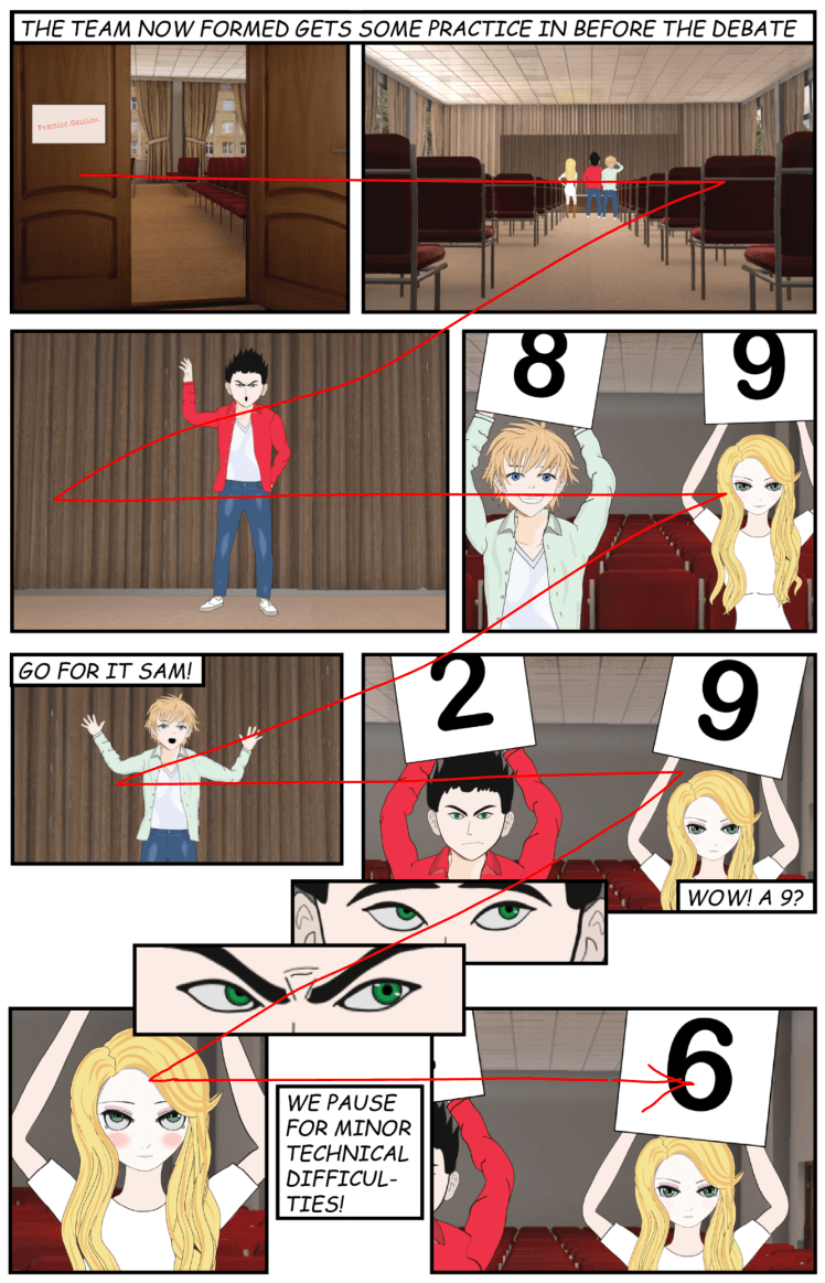
In the following example, the alignment is more down the page for interest, but the speech bubbles have been positioned to held draw the eye down the page.
Having said the above, remember that this is my first attempt at a comic! I don’t claim to be an expert! But I have found thinking about the eye flow down a page helpful.
You will also notice I decided to have white gaps between frames, and black borders a few points wide around them. I thought it looked cleaner. However the speech bubbles I did not restrict to being within frames. Allowing them to be outside the frame helped guiding eyes follow a flow down the page.
The frames themselves are typically created with the Indesign “Rectangle Frame Tool”. I created “Object Styles” to make it easier to share formatting across all the objects (e.g. I can change the style definition and the border width of all frames changes).
Spreads
While in Indesign I am using 2 page spreads. That is where 2 pages are displayed side by side, as would appear in a printed magazine. I purposely tried to segment the store so stages of the story fit onto one or two spreads – they never span a spread. This may not be necessary, but it means if I do print it, each time you open a page, the full content of a scene from the overall story is visible.
This however meant some spreads have more frames than others, to make the content fit. Sometimes I may have erred on the side of squeezing too much in. I may go back a fix a few pages. But in my mind the comic must also keep flowing along, so you don’t want to spend too long on any one page.
If you are thinking about printing the comic later, remember if you do a double sided print with staples down the middle, you need an even number of spreads or else you will get white sheets left at the end of the comic. I will probably never print my comic… it can get pretty expensive for small print runs. I will settle with online viewing.
Speech Bubbles
For speech bubbles, there are commonly used conventions for normal text (with a squarish or oval shape), voice from a speaker or phone with a jagged arrow, a jagged shape for impactful text, cloud bubbles for silent thoughts, and so on. I have also seen dotted lines for whispers.
For my comics, the artwork is not spectacular, so some scenes are fairly speech intensive. This is not what I would consider a more typical comic where the artwork is the real appeal. As a result, I went with rectangular speech bubbles as I could pack them in more tightly. I try to keep the number of speech bubbles on a page lower, but I am using the exact same script as the video as the comic, and there are a few points I have with longer dialogue.

To create the little arrows out of the speech bubbles (pointing to the character that is talking), I used the “Pen Tool” to draw the pointy arrow fully overlapping the edge of the plain rectangle. (If it does not overlap, things don’t work well.) I also found that if the arrow is too big, text starts to flow into the arrow – so I try to keep them fairly small.
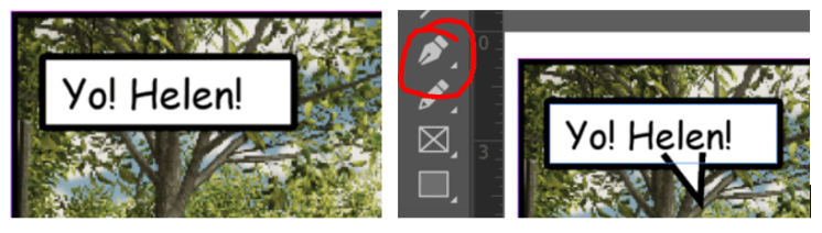
Then, bring the text box to the front, select both objects, and use the “pathfinder” tool to merge the layers. If the text box is not at the front, I found the text formatting got messed up.

Next, most comics use text in ALL CAPITALS. Apparently Marvel comics went through a period of trying normal mixed caps text, but returned to all caps. Because all caps tends to use up more space, I decided to go with normal text for character speech, reserving all caps for narrator comments. But if you look around, I think all caps is more common so this might not have been the best decision. (I could have just reduced the point size to fit the same amount of text in.)
Sharing the Result
Adobe Indesign has a few options for sharing the final result.
- You can export a PDF file (make sure you set the resolution to maximum if you want to print the result later).
- You can export the PNG images per page. This is useful with the CBZ format (Comic Book Zip files) for online download of comics. (Its basically a ZIP file full of pages.)
- There is EPUB, an electronic publishing format (supported I believe by devices such as the Kindle).
- Indesign also supports an “online publish” mode which creates a web site with simple forward and back pagination through pages.
I am probably going to either use the PDF file, or put together a web page with PNG files per page. I might create a CBZ file for the full series, also with a metadata XML file defining the page boundaries. My concern with Indesign is while its convenient for collaboration during a project, I assume its tied to my Adobe subscription. I may drop my subscription after I finish my series, in which case hosting the final comic somewhere else seems to make more sense.
Conclusions
All up I am pretty happy with where I have ended up. The comics look as good as I think I can expect. Using Adobe Character Animator to pose the puppets seems to have worked pretty well. So I may push through and try to complete the series completely as comic books first, then come back and finish the animation (by which I hope by volunteer voice actors will be available again).
I did however hit one gotcha for the online publishing mode. If you scale down images to be significantly smaller than the original, you can notice at times pixelization creeping in. It is considerably worse than the 300 dpi setting, and so looks like a possible bug in Indesign. However, if you select a frame holding an image, you can select “Object” / “Object Export Settings” and manually set a high dpi value to use. The default is not good enough quality (for myself). PDF files don’t have this problem however, so I may just end up using that.
UPDATE 2018-08-26: I have just published the first 4 chapters as comics on the home page as PDF files (https://extra-ordinary.tv/). Subsequent chapters will be available there as they are completed.
