I am planning to reboot my “Extra Ordinary” animation series using web stories. The animated version was fun, but I found it too hard for a hobby project to work with friends as voice actors, and full animation with speech bubbles (no audio) feels weird to me. It feels like poor man’s animation. (I tried it!) So I am going with mainly static images with some animation added here and there to spice it up. The web stories format is a good fit for this.
Web stories is a mainly vertical format suitable for mobile phones based on HTML. One of the challenges is that not all phones are the same dimension. This leaves you the choice of letterboxing (leaving a gap at the side or top of images), or filling (cropping a bit of image off on the sides or top as needed). For the main image filling generally looks better (720 x 1280 is the recommended image size for web stories), but it is not acceptable for speech bubbles to be chopped off as it may make the text unreadable.
One solution is to use separate image layers for the background and the speech bubble overlays. (This also makes it easier to translate to multiple languages if desired – just replace the speech layer.)
There are three cases I therefore set out to solve:
- A speech bubble positioned on the page, but where it is guaranteed never to be cropped even if the main artwork is cropped.
- A narration bubble at the top of the page (typically a rectangle) – it should touch the left, right and top edges of the screen on all phones.
- A narration bubble at the bottom of the page.
In addition, the text (which I plan to create using an image using a comic font) must be the same size in all 3 locations (not scaled differently).
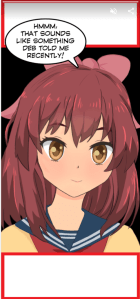
Here is a sample on an iPhone X screen dimensions. The red boxes at the top and bottom are to simulate narration text that might appear at the top or bottom. (The red outline is to make it clearer where the edge is.) You would normally only use one of these three options at a time on a page.
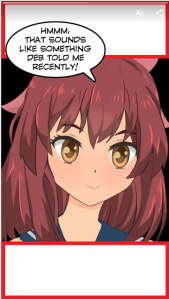
Here is an example of the same page on a Pixel 2. Notice that the speech bubble is a bit bigger as the phone is wider. The main artwork is also cropped slightly differently due to the different aspect ratio of the screen.
This blog post describes the HTML and CSS markup I used to achieve this in a web story. An example one page story can be found at https://alankent.github.io/extra-ordinary-amp-stories/rin/comic-test.html. You can use “view source” to look at the full markup. I am going to only focus on key points here.
Web story pages consist of one or more layers. Each layer can choose which layout template to use. The fill template scales the layer to fill the available space (cropping some edges if required). In this example, the main artwork is animated, so a video file is used.
<amp-story-grid-layer template="fill">
  <amp-video autoplay loop
      width="720"
      height="1280"
      poster="rin.jpg"
      layout="responsive">
    <source src="rin.mp4" type="video/mp4">
  </amp-video>
</amp-story-grid-layer>
There is also a vertical template (down the page) where with a little bit of extra CSS you can cause content to be positioned relative to the top or bottom of the screen. By default, there is padding around the edge of content in vertical mode, so it needs to be disabled. For example, the following CSS class can be used with vertical for a layer that spans the full width of the display and sticks to the top of the page.
amp-story-grid-layer .top-noedge {
  padding: 0px;
}
This is then applied to the layer containing the narration text to stick to the top of the page.
<amp-story-grid-layer template="vertical" class="top-noedge">
  <amp-img
      src="red-612x210.png"
      width="612"
      height="210"
      layout="responsive" />
</amp-story-grid-layer>
The following CSS defines a class to make it stick to the bottom of the page
amp-story-grid-layer .bottom-noedge {
  padding: 0px;
  align-content: end;
}
To position a speech bubble on a page (each speech bubble might be in a different location, so a CSS classes are less useful) I use a style attribute and adjust the padding and width as required. This is appropriate when the image is just the speech bubble (no space around it). An alternative strategy is to use the top-noedge CSS class above and pad the speech bubble with transparent areas around the speech bubble.
<amp-story-grid-layer template="vertical"
    style="padding-left: 10px; padding-top: 50px; width: 70%;">
  <amp-img
      src="speech.png"
      width="1337"
      height="817"
      layout="responsive"
      alt="Hmmm, that sounds like something Deb told me recently." />
</amp-story-grid-layer>
That is all it takes! Pretty straightforward and the text will always scale appropriately for the device it is being viewed on.
Now all I have to do is create content!
 Extra Ordinary, the Series