I still dream of creating a lightly animated anime-styled comic, using VRoid Studio characters in Unity (an engine for creating games). Even if I don’t ever publish an episode, it has been an interesting journey learning about the skills that go into a great anime.
My general plan to reduce effort is to use locations created in Unity for the backgrounds, buying assets from the Unity Asset Store. But the result often feels like a computer game, rather than like anime. So I sat down to look at a good quality anime show (take your pick – I used Fruits Basket here) to see what I could learn. Rather than focusing on the show, I focused on the use of composition, color, focus/blur, and background images.
First, there are numerous scenes with normal backgrounds. Nicely artistic, fairly standard colors. Many times the background is logical to the location of the scene. There are concepts in composition for shots, such as “the rule of thirds” where things can look better when they are offset from the middle. Here Tohru is offset to the right, but framed fairly equally by having a bland wall on the left. (With characters moving around in a scene you cannot line things up perfectly all the time.)

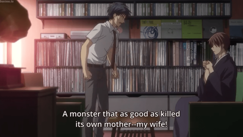
The contents of a background can have a message. Kyo’s father has been angry with Kyo ever since his wife died. Outdoor shots of the house look modern. Inside however Kyo’s father is always in the same room. It is not well lit. The wall is covered in vinyl records (on the left is the old record player). He never leaves the room, playing his old records – he is stuck in the past, unable to move on.
Another scene, Kyo is on the way to see Tohru in hospital. Here he has left home but he decides he has to do something (visit his father) before visiting Tohru. There is a bridge he has to cross. Blue skies lie beyond, but it’s a big bridge (metaphorically and in real life). One does not ask why he has to cross a real, large, bridge across a major river when I believe his father also lives in the same Sohma estate as Kyo. But his emotional journey requires him to cross a bridge, so…

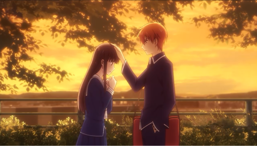
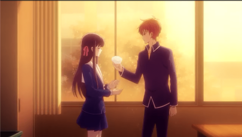
Color is often important in scenes. The following are from some different heart-warming scenes. Notice the warm yellows and the rule of thirds. There is a softness to the whole picture.

Kyo comforts Tohru gently, centrally framed.
Just as Kyo helps with decorations in a completely different scene. The lead in can be more normal, but when there is a special connection between them, warm colors with a softened background.
The vibe is very different with Akito . The scenes are often a cold blue, with lots of shadows. There is often a hint of menace or malice. In this first scene, Shigure is (foreground) also adds to the unease. Shigure is looking down at Akito. The shot also has a feeling of weakness with Akito. Vulnerabilities, yes, but warmth, no.

Loneliness is also often reinforced with distant shots. Note again the nice balanced composition (rocks in the middle, evenly balanced supporting beams on both sides) and the colors.

Distant shots are used in other places to reinforce the idea of isolation. Yuki here is deciding what to do about the address left on the table by Tohru when she left to return to the newly remodeled house of her Grandfather. Wide shot, wide table, simple background, the note is center, hands under the table (not a strong, “in command” posture).

When Tohru is in her grandfather’s house, engaging with the others, there is no feeling of warmth. Colors are not used here, but notice how nobody is looking at each other or Tohru? Their very posture shares the message of awkwardness and discomfort.
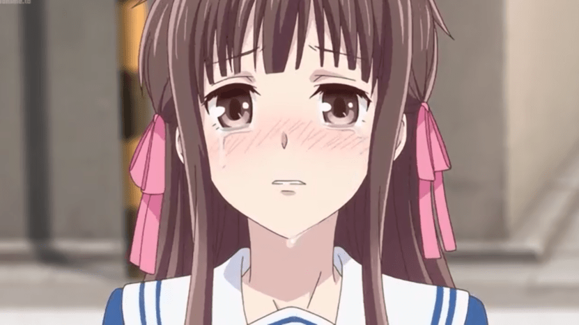
When Tohru leaves the house with Kyo and Yuki, it is interesting to see some shots outside. The first she is embarrassed. Center shot, concrete backgrounds. It is a goofy expression.

But when things get serious and her true feelings come out (she starts crying), her face is larger and the background image is blurred out, drawing even more attention to her in-focus face.
There are other ways of course to emphasize a scene. Sometimes backgrounds are completely abstract, often to reinforce a joke. “…fighting is dangerous…”, with of course Tohru waving around a hot iron in her hand that the two boys are trying to dodge.

The use of light and dark is often used. There is something not quite right with Machi, who made a complete mess of the main room. Machi is in the darkness, not clearly visible. She clearly does not fit in with the others.

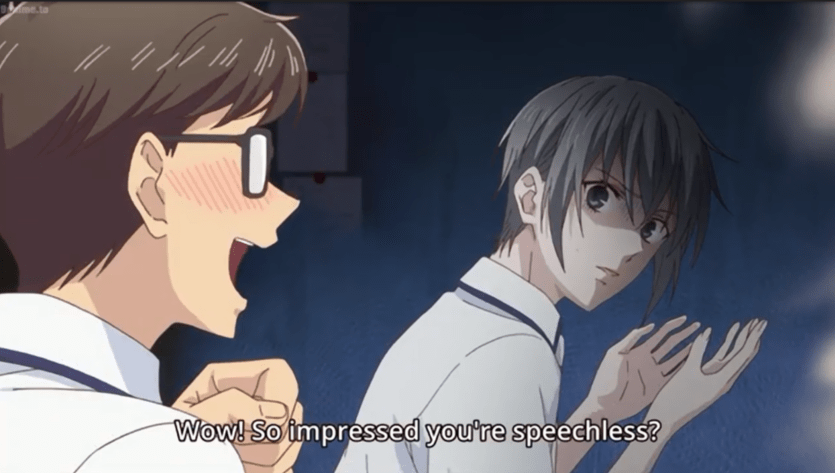
Notice the different coloring on the two faces (as well of course as the eyes)! On the left is a feeling of joy; on the right is disbelief.
Here Tohru and Kunimitsu are leaning over a table. The use of light and dark, abstract background (highlighting another comical scene), unusual perspective create an uncomfortable vibe to the scene.

Another comical background, with warm colors reinforcing the comradeship, even if Yuki is not yet comfortable. These two become friends.

Another example usage of colors (pink in this case) with soft bloom effects. These are flashback scenes. The change in tone helps clarify which shots are current day and which are flashbacks.

Let’s throw in a pink cherry blossom tree behind his head for good measure.

It may be of no surprise that there is a lot of depth to a well created anime. When done well, scenes do not all look the same. The framing of shots, the contents of the background, the angles of cameras, the colors, the blurring of backgrounds or the whole image, the use of non-real backgrounds – all of these tricks are combined to reinforce the desired feeling of each scene. Even if I never succeed in creating my own series, by studying existing shows I have discovered a greater depth than I had previously appreciated. A well-made show is definitely a work of art.
Even just adding some depth-of-field camera blur can make a shot feel that little bit less like a computer game.